Ruthlessly Eliminating Layout Shift on netlify.com
Updated on 17 November 2023 to simplify the CSS to use :defined
On the Netlify web site, we have a little banner that appears at the top to drive traffic to new and exciting things happening in Netlify-land.

That banner has exactly two features:
- An advanced HTML feature known only to a select few Old Guard developers: the hyperlink.
- A close button (which saves the preference for future page loads)
There are a few key performance milestones in the lifecycle of this component, and this is how worked previously:
- The page’s initial render. The banner is ⚠️⚠️⚠️ hidden by default. Without JavaScript or before JavaScript loads, the banner is hidden.
- After the JavaScript loads, we check
localStorageto see if the user has closed the banner previously. We hash this preference to the banner URL so that if the banner changes, it will render even if the user has opted out previously. If applicable, render the banner. - Lastly we bind JavaScript events to the close button. Events are not necessary for the hyperlink, because its behavior is delivered exlusively in HTML (very much wow).
Steps 2 and 3 were bundled and executed together in the same component code file. And in some earlier iterations of the site, up the amount of time that elapsed between Step 1 and 2 could be up to ~600 ms.

On our new site (faster, mind you) redesign we inlined the JavaScript for Steps 2 and 3 into the end of the <body> and the delay was still very present:

The fix
What we needed to do was swap the behavior. The common use case was to visit the site without the opt-in preference to hide the banner. We must make the banner visible by default and make the JavaScript path to hide it the exception to the rule.
This changes our previously mentioned Step 1, the page’s initial render, show the banner. Without JavaScript or before JavaScript loads, the banner should be visible.
We also split the JavaScript code for the component into two separate pieces: one piece to check whether or not the user has the preference to hide and a separate Web Component to bind the events.
Update: I’ve packaged up the code below and put it on GitHub for re-use.
CSS and HTML
We use opacity to toggle the close button so that it doesn’t reflow the component when it’s enabled via JavaScript.
.banner--hide announcement-banner,
announcement-banner[hidden] {
  display: none;
}
/* The close button will not be visible until the component is registered,
 * preventing ghost clicks on the button before the event listener is added.
 */
announcement-banner:not(:defined) [data-banner-close] {
  opacity: 0;
  pointer-events: none;
}<announcement-banner>
<a href="https://www.netlify.com/sustainability/">Read about our Sustainability</a>
<button type="button" data-banner-close>Close</button>
</announcement-banner>JavaScript
banner-helper.js, put into the <head>:
// the current banner CTA URL, we inject this from a JSON data file
let ctaUrl = "https://www.netlify.com/sustainability/";
let savedCtaUrl = localStorage.getItem("banner--cta-url");

if(savedCtaUrl === ctaUrl) {
  document.documentElement.classList.add("banner--hide");
}banner.js, defer this until later (how much later is up to you):
class Banner extends HTMLElement {
  connectedCallback() {
    let button = this.querySelector("[data-banner-close]");
    if(button) {
      button.addEventListener("click", () => {
        this.savePreference();
        this.close();
      });
    }
  }

  savePreference() {
    let cta = this.querySelector("a[href]");
    if(cta) {
      let ctaUrl = cta.getAttribute("href");
      localStorage.setItem("banner--cta-url", ctaUrl);
    }
  }

  close() {
    this.setAttribute("hidden", true);
  }
}

window.customElements.define("announcement-banner", Banner);
Astute readers will notice that the above is a web component but let’s just keep that between us.
The Results
Note that the first render contains the banner! This is the same render behavior whether or not JavaScript is in play.

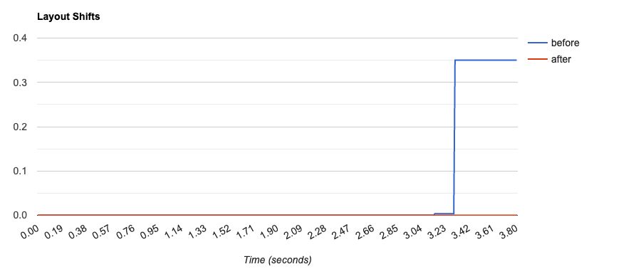
In this waterfall comparison, you might note that we reduced layout shift metrics to zero.

And because we inlined the script for repeat views into the <head>, when you hide the banner and navigate to a new page, the banner will be hidden before first render too.
Not too bad for a few small changes!
Next target will be to improve the web font render.


25 Comments
Phil Wolstenholme
Thanks for writing this up, I've just changed my approach on a project I'm working on now as a result of seeing the way you're using JS (but in the `head`) to control visibility 👍
Zach Leatherman
Awesome! 👍🏻
Jouni Kantola
Would there have been any performance upside or downside by running the class toggle script in the web component instead to not have blocking code in head?
Zach Leatherman
Yeah, that’s too late. The second filmstrip in the post showed similar behavior
Jouni Kantola
All right! Thanks for the writeup. By that, I gather head is the way to go for light/dark mode toggles as well.
Lukas Grebe
I don’t necessarily understand banners. I’ve navigated to a specific content for some reason. Why distract and point my attention at some other very specific content, instead of maybe pointing out this content AFTER the content I originally came for?
Lukas Grebe
a fun anecdote: I heard you like banners so we put a banner on the landing page of the banner so you can click the banner to see another banner!
Zach Leatherman
Yeah I’d wager that too 👍🏻
Lukas Grebe
Look: German has a name for it de.m.wikipedia.org/wiki/Störer_(W… Still. I wonder if the very first impression shouldn’t be a Störer but something else.
Søren Birkemeyer 🦊
Because marketing.
Lukas Grebe
Absolutely and this is only a tangent to the technical discussion. (Which w/o Marketing wouldn’t be needed) Im saying a general banner for everyone on every page (even the landing page of the banner) might not be the best way to go.
Lukas Grebe
FTA:“The common use case was to visit the site without the opt-in preference to hide the banner. We must make the banner visible by default“ - I’m saying this premise might not be complete
Lukas Grebe
I ❤️ netlify and marketing IS marketing 🤷♂️ So let’s just leave it at „yay for less content shifting and a faster web“ 🥰
Zach Leatherman
❤️ I think it’s a fair point! Just for the technical discussion about hiding the banner on the target page, I’m also thinking about the benefit of navigation stability on navigation between pages.
Zach Leatherman
The other complaint I currently have about our banner is that the small viewport nav close button isn’t in the same place as the open hamburger icon when the banner is open 😱
Šime Vidas
This sounds like a use-case for progressive rendering.
Zach Leatherman
Is this separate from the normal progressive rendering behavior of HTML
Šime Vidas
Basically, splitting the page into parts and loading, executing, and rendering each part separately in sequential order. <!-- header --> <link rel="stylesheet" href="header.css"> <script src="header.js"> <header> … </header> … Truncated
Stoyan Stefanov
hm, and your feed broke perfplanet.com Looking... :)
Zach Leatherman
😅 sorry!
Stoyan Stefanov
haha, I think I got it! My 500 char substring cut off the ⚠️ emoji so json_encode couldn't handle it github.com/stoyan/perfpla…
cthos
We should be sharing the good word of webcomponents. Allllll the good words.... O_O
Zach Leatherman
Can I curse too or are the bad words off limits
cthos
I do so regularly, so yes.
Adam Duncan
@zachleat did a write-up on how they tackled it at Netlify a little while back: zachleat.com/web/layout-shi…