Laissez-faire Font Smoothing and Anti-aliasing
Recently, Twitter made a global anti-aliasing CSS change to their website. Before writing this post, I didn’t know very much about anti-aliasing—so I decided to learn everything I could about it to better understand the reasoning behind a decision like that. Here’s what I learned.
Controlling anti-aliasing modes in CSS is easy. A little too easy 
-webkit-font-smoothing and -moz-osx-font-smoothing. The full browser support matrix is available under font-smoothon Can I Use. But before we dive in, let’s level set on what the values for these properties are:
- Disabled:
-webkit-font-smoothing: none- In my tests, Firefox had no mechanism to disable font smoothing 👍
- Grayscale anti-aliasing (also known as Full pixel or Traditional anti-aliasing)
-webkit-font-smoothing: antialiased;-moz-osx-font-smoothing: grayscale;
- Subpixel anti-aliasing
-webkit-font-smoothing: subpixel-antialiased
- Let the browser decide (Uses subpixel anti-aliasing when available; this is the default)
-webkit-font-smoothing: auto-moz-osx-font-smoothing: auto
Try it out on this page
What’s the difference between these modes?
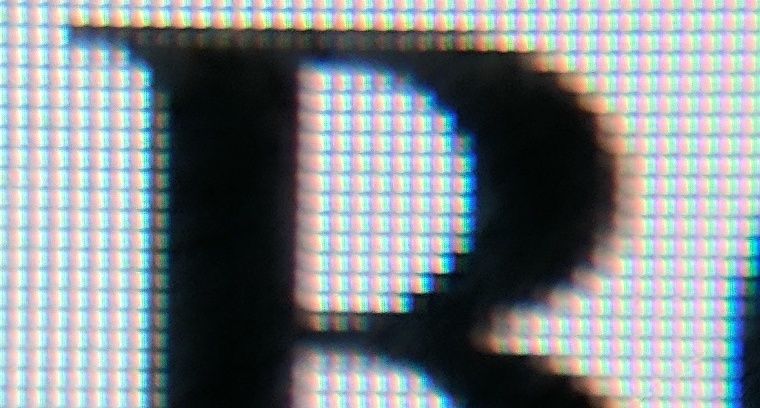
To get a closer look, I strapped a cheap 25x macro lens to my smartphone and took some pictures. They’re pretty distorted around the edges because of the lens, but they’re good enough to see what’s going on.
When you zoom in on the image, you can see the individual pixels—each with their own red, green, and blue lights! Fascinating!
Compare the three different modes below. These photos were taken of 24px text using the Times typeface displayed on an LG UM95 Ultra Widescreen monitor (109dpi, a low DPI makes it easier to see).


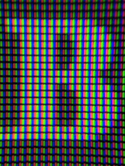
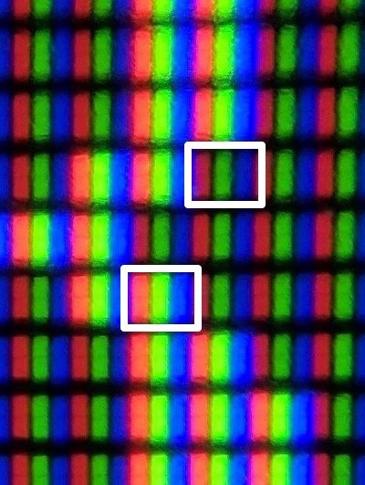
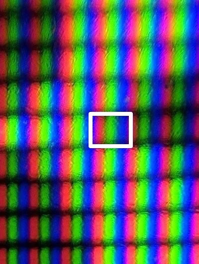
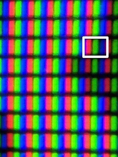
Remember that hexadecimal color values have 2 hex digits for red, 2 digits for green, and 2 digits for blue? Note that when those values are all the same (#eeeeee, #222222, or #666666), the color is a shade of gray. The same principle applies for the pixels in grayscale anti-aliasing. When each red, green, and blue light are illuminated the same, the pixel appears to be gray.
Subpixel anti-aliasing uses a similar technique, but with the full RGB color pallette. Making a pixel red means that only the left third of the pixel will be illuminated, which gives us additional rendering precision.
While subpixel anti-aliasing is considered to be state of the art, hardware advancements are rendering (͡° ͜ʖ ͡°) it unnecessary. On HDPi or retina screens, subpixel anti-aliasing is increasingly unnecessary to render an accurate portrayal of a glyph. The more pixels you have to work with, the more effective grayscale anti-aliasing is. That’s why it’s unlikely that iOS will ever support subpixel anti-aliasing, saving them the work of supporting the font-smooth property.
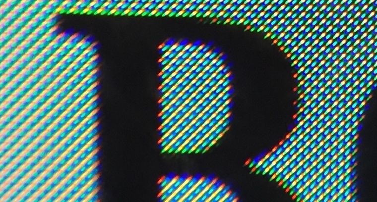
But not all screens share the same horizontal stripe pixel geometry. Here’s a Google Pixel smartphone, using a diamond subpixel shape called PenTile (trademarked by Samsung). As the picture shows, PenTile clearly does support subpixel anti-aliasing, but does not support controlling it with the -webkit-font-smoothing property. A diamond configuration is likely to handle subpixel rendering in different orientations better than a horizontal stripe could.
So, Twitter made a change
Recently twitter.com switched their website to force grayscale anti-aliasing on HiDPI screens:
@media screen and (-webkit-min-device-pixel-ratio: 2), screen and (min-resolution: 2dppx) {
	body {
		-moz-osx-font-smoothing: grayscale;
		-webkit-font-smoothing: antialiased;
	}
}
Asthetically as we’ve seen, using grayscale anti-aliasing makes things appear lighter and thinner. It’s usually employed to lighten text or icons that are placed on dark backgrounds, almost as a shortcut to avoid loading an additional (but perhaps more appropriate) Light or Hairline web font. It is unusual to apply this change to a site globally but from a technical perspective it is consistent with iOS’ preference for grayscale anti-aliasing. Perhaps it would clash with Android’s embrace of subpixel anti-aliasing if -webkit-font-smoothing were supported there.
To see more big players in the font-smooth game, check out the Microsoft Edge CSS Usage list. Related: yahoo.com does some weird stuff.
Conclusion
Taking a “smoke ’em if you got ’em” approach to subpixel anti-aliasing feels warranted here. It seems silly to opt-out of a technically superior subpixel approach if it’s supported on the user’s platform and browser.
Platforms that support subpixel rendering may or may not support font-smooth to control it—Android is a prime example of this. After reading issues on web browser bug trackers, it almost seems like the browsers that did implement this now regret doing so. But independent of font-smooth support, subpixel anti-aliasing is not going away any time soon—even if iOS holds out forever.
The safe bet here is to defer to browser and platform defaults and only use font-smooth overrides sparingly and as a last resort.
Sources
- Please Stop “Fixing” Font Smoothing (2012) from Dmitry Fadeyev
- Anti-aliasing 101 (2013) from Paul Lewis (@aerotwist). It appears that some of the layering criteria may be outdated here. The first three sections are great though.
- MDN
font-smooth - Font Smoothing Explained (2009) from Krzysztof Szafranek
- Sub-pixel text rendering (2012) by Bjango
- Understanding Sub-Pixel (LCD Screen) Anti-Aliased Font Rendering (2007) from Darel Rex Finley
- Anti-Aliasing on the iPhone (2007) from John Gruber
Updates
Sub-pixel anti-aliasing reportedly removed in macOS Mojave:
Subpixel antialiasing for text is gone in macOS Mojave.
—John Siracusa (@siracusa) June 5, 2018
Subpixel AA was removed from the OS, but browsers still do it by default. See https://www.joshwcomeau.com/css/custom-css-reset/#digit-font-smoothing
—@simevidas April 14, 2022



7 Comments
Šime Vidas Disqus
15 Jun 2017Markus Stange Disqus
17 Jun 2017Šime Vidas Disqus
03 Jul 2017Keyamoon Disqus
16 Jun 2017zachleat Disqus
05 Jul 2017Henry Bley-Vroman Disqus
05 Jul 2017zachleat Disqus
07 Jul 2017