Conservative Design: Option List
This is another post in the series entitled Conservative Design Patterns for Form Elements.
Next we’ll look at a web component that is almost ubiquitous among user interfaces today, the Option List. The Option List can take any one of the following three forms.
- Multiple Selections: User can select any number of the options presented to them. Types: Checkbox Group, Multiple Select Element
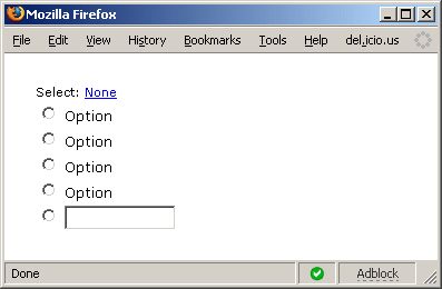
- Single Selection: User can select none or one of the options available. Types: Radio Group, Select Element
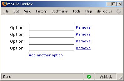
- User Input List: User types in the options that they want to use. All inputs are marked as selected. Types: Group of Textboxes
We’ll describe each of these variants separately.
Multiple Selections:
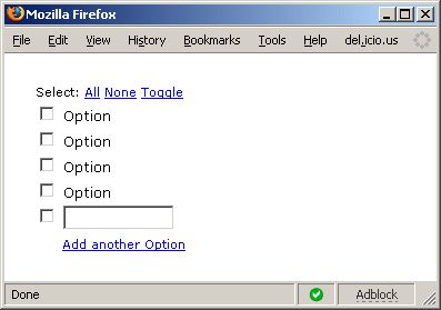
- Validation: The user can select at least one, an integer range of options, or any number of the options presented.
- Quick Links: optional links to select all options, clear the options, and toggle the options to the opposite value of what they currently hold.
- Customizable Values: optionally allow the user to add their own options (one, an integer range, or many) to the list.
- Other Variants: Any Select Element, as described in the original post.
Single Selection:
Minimum Feature Set:
- Validation: The user can select at most one of the options presented.
- Quick Link: optional link to clear the options
- Customizable Value: optionally allow the user to add their own option (only one is required, since only one can be selected).
- Other Variants: Any Select1 Element, as described in the original post.
User Input List:
Minimum Feature Set:
- Validation: The user must have at least one of the text fields with a value (doesn’t matter which one). Or the user must have an integer range number of fields with values.
- Quick Link: optional link next to an element to remove that element from the list (not clear it, remove it)
- Customizable Values: optionally allow the user to add their own options (up to an integer limit).
- Other Variants: Any List of InputX Elements, as described in the original post (could be passwords or textareas).
The images above for all three component types show a textbox for the addition of another option, but this should also allow customization to allow any type of (Select or InputX) element for the addition of another option.

