Conservative Design: Command Line Interface
This is another post in the series entitled Conservative Design Patterns for Form Elements.
The argument has existed since the dawn of the Graphical User Interface (GUI). Which is better, keyboard-exclusive Command Line or mouse-intensive GUI’s? As more enterprise architectures are moving from terminals to web interfaces for their products, and as time is moving forward with the everyman user desiring an interface that looks pretty and easy to use, we’re seeing a drastic reduction in the utilization of the keyboard.
But with the exception of form input, we’ve almost completely moved away from the keyboard as a means to execute functions and navigation. I’m proposing that we bring back the power of the keyboard. Obviously we can’t get rid of the GUI altogether, but instead complement it with a powerful command line.
This component could exist as a standalone command line interface component or as a supplement to any search bar your page may contain. The basic premise of the Command Line Interface component is to provide a standardized method of navigating your website using nothing but the keyboard. It could fulfill more complex operations, but the scope of this article will just cover command line rudimentary navigation.
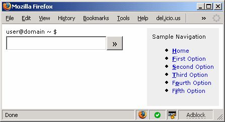
Screen Printing: Fake Command Line Example

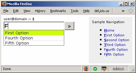
Screen Printing: Fake Command Line Example of AutoComplete Capabilities

Minimum Feature Set: (source)
- Autocomplete: must be able to finish the current command being typed by presenting a list of available options to the user. Must be compatible with keyboard navigation:
- UP and DOWN arrows to select from list
- TAB autocompletes to first option
- Markup Scanning for Applicable Links: scan the current dom for tags with a href element that could be used in autocomplete.
- Quick commands: markup options (custom attributes?) to allow the programmer to define commands in the html. These are one to three character combinations that execute a link or event.
- Standardized Command Set: standardized hot key to force focus to the command line. Also, for navigation options that are standardized between every website, have a standard set of commands that will execute with the same behavior, regardless of navigation implementation (Home [H], Login [L], Register [R], Forgotten Password [FP], Contact Us Page [C], Privacy Policy [PRIV], Terms of Service [TOS])
Luxury Feature Set:
- Markup Scanning for Events: sometimes navigation is executed through event handling. Scan the events assigned to nodes for any available options that could be executed in navigation.
Limitations:
- Limitations on any sort of mouse-required interface: drag and drop
- Interaction with flash?
Idea Credits:


