A Mobile Web Divided
Unless you’ve been living comfortably under an elaborate dwelling constructed entirely out of rock, you’re aware of the growing popularity of smartphones and other mobile devices. With that growth we’ve witnessed a bumper crop of component libraries and frameworks to enable us to create mobile web sites and applications.
One Web, Two Web Primer
There are two different approaches one can take when developing a mobile web site. The first approach has been assigned the delightfully inclusive moniker ‘One Web’. One Web involves creating a single web site accessible from both mobile and desktop web browsers and the site’s presentation is custom tailored at run time to the capabilities of the user’s device.
The second approach involves creating two completely separate web sites, one for mobile and one for the desktop. The advantage with this approach is that content and the user interface can be tailored specifically for mobile, as the user’s context while using each site is likely to be drastically different. An obvious nickname for this approach might be ‘Two Web’.
Two Web involves a white list of mobile User Agents that server side code uses to detect mobile devices and redirects them to a mobile specific site. The remaining User Agents are left to view the desktop version. An improvement to this approach allows end users to opt-out of the mobile version by simply clicking on a link that redirects to the desktop version and persists the setting (often using a cookie).
With One Web the site is customized and adapted based primarily on screen dimension, orientation, and pixel density. Contrast that to Two Web, which usually divides touch screen and non touch screen devices. While this may make it easier on developers, it’s awkward for users. For example, consider Google Plus on an iPad. The entire experience feels like it was intended for a small screen, and feels barren and feature-poor on the larger tablet screen. The full Google Plus web site would be better for the iPad.
Other downsides to Two Web include maintenance of two separate code bases, maintenance of the User Agent white list as new devices are released, and dependency on server side code to redirect mobile User Agents to the mobile site.
Developers should also be aware of the historical precedence of browser vendors borrowing User Agent strings from other devices as they become popular. That’s why almost all User Agents in existence today contain the string “Mozilla” and why WebKit User Agents contain “like Gecko.” Come to think of it, User Agent theft happens most often when the target is Netscape or Netscape progeny.
Make Your Choice
An informed reader might already be aware of the choice between One and Two Web. What you might not be aware of is that your mobile JavaScript libraries and toolkits may have already made this choice for you. The mobile web development space is clouded with tools that don’t document their requirement of Two Web.
Most of the tools that have been reviewed below have focused on WebKit support only. It is not the author’s desire to simply suggest that these tools should work on non-WebKit mobile browsers. The tools we use should not create a web divided between mobile and desktop. In a theoretical world where WebKit has a global monopoly on both mobile and desktop web browsing, it would still create problems if sites are restricted to mobile only or desktop only. Developers must be aware of the compromises we’ve inherited from our tools.
As of June 2011, mobile web browsing is only 6.5% of all web browsing, while 24.5% of all web browsing is desktop WebKit (non-mobile browsers like Chrome or Safari). While evidence would suggest that the share of mobile web browsing will increase, we should be very cautious to assume that WebKit (mobile or desktop) will ever reach anything close to 100% market share.
Let’s look at how a few sample pages render in a few desktop browsers. (Keep in mind that I did not test in the other major rendering engine, Presto currently used by Opera 11.5)
Sencha Touch 1.1.0
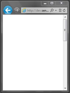
Trident (IE9): Not Supported
Gecko (Firefox 5): Not Supported
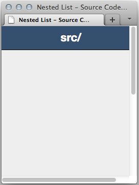
Instead of a nice list with large click targets, we’re greeted with a simple white screen. No error messages detailing a JavaScript error occurred on the page. No warning saying the web browser being used here isn’t supported (the bane of Progressive Enhancement advocates). Really bad user experience here.
Officially, Sencha Touch support is not “anything WebKit” as some have suggested. It officially supports Apple iOS 3 , Android 2.1 , and BlackBerry 6 devices. It does not include WebOS, which is a WebKit browser, nor does it include any desktop web browsers.
DHTMLx Touch v.1.0 RC
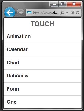
Trident (IE9): Not Supported
Gecko (Firefox 5): Not Supported
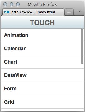
DHTMLx Touch operated much better than Sencha Touch on desktop browsers. Despite the fact that many of the demos on their website are hidden behind QR codes. You can use a QR decoder to get the URLs for viewing on your desktop device. As for official web browser support, the DHTMLx Touch web site states:
While browsing the demos of DHTMLX Touch, note that the framework requires a mobile device to display and work correctly. You can also run the demos on standard PCs in Firefox 3.6 and above, and WebKit browsers (Safari, Chrome, etc.), but there still can be some issues since DHTMLX Touch is optimized for mobile devices.
Unfortunately, even though it works for the most part, desktop web browsers are still unsupported. It should also be noted that DHTMLx isn’t full WebKit either, as Blackberry 6 is not yet officially supported.
Dojo Mobile 0.2
Trident (IE9): Supported
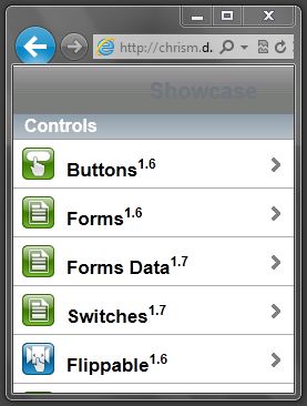
Gecko (Firefox 5): Supported
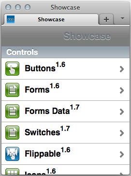
Dojo Mobile also did fairly well. There were a few minor rendering issues with WebKit prefixed gradients (and no background color fallback) which I would consider to be very minor bugs. Here’s the good news from the Dojo documentation:
Dojox.mobile supports not only webkit-based mobile browsers, but also non-CSS3 desktop browsers such as IE and (older) Firefox.
jQuery Mobile 1.0b2
Trident (IE9): Supported
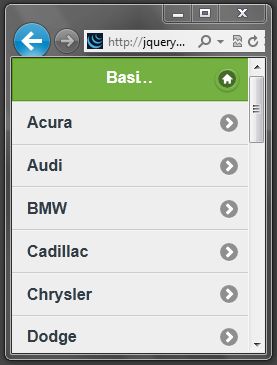
Gecko (Firefox 5): Supported
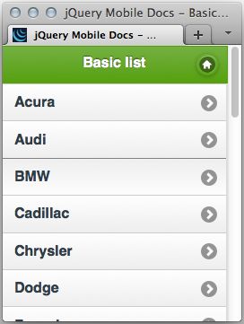
In most of the other frameworks, cross browser compatibility documentation felt like an afterthought mentioned in passing. Not jQuery Mobile. It has the most complete web browser support documentation of any mobile component framework. Not only is their documentation the best, their device support is the most comprehensive. The project officially supports Internet Explorer all the way back to version 7, which speaks volumes to their commitment to allow the developer to make the choice between One Web and Two Web.
Conclusion
If you’re developing Hybrid Native applications using software like PhoneGap, desktop web browser support doesn’t matter here. Feel free to disregard this entire article.
However, if you are developing for the web I would encourage you to look strongly at One Web as the default choice, and use Two Web as the exception when your content and context require drastically different non-adaptable versions of the site for mobile devices. Certainly I’m not suggesting that either One or Two Web are silver bullets. But we should all be aware of how the tools we choose weigh on our decision, and how this decision will affect our users in the future.



2 Comments
Dan Disqus
15 Aug 2011Zach Leatherman Disqus
08 Oct 2011